Our infographics are a new initiative at The BMJ. We know that you, our readers, are increasingly time-pressured, so we aim for them to include some carefully selected information from an article, highlighting the key messages. We hope that you find them quick and easy to use, and that they also help you to remember the information they contain.
BMJ infographics are reviewed by the authors, our technical and section editors and with some the peer reviewers before publication, and we're confident that they are accurate representations of the article. At the time of going to press, we make every effort to ensure that the information held in them is up-to-date. However, because of their innovative nature, we add disclaimers to them, to remind our readers that the information contained should be treated with the same caution as written articles. The graphics are often a summary of a summary - they shouldn't be taken to be the whole of the information available on the subject. Rare conditions/complications/etc will sometimes be excluded.
While our infographics are not validated decision aids that have been extensively tested on clinicians or patients, we want them to be useful to readers in summarising recommendations or evidence. If you have any comments about their usability, we'd be glad to hear.


")


")


![[Infographic] Discussing an emergency care plan](https://www.bmj.com/sites/default/files/styles/bmj_infographic_thumb/public/resuscitation_v18_web_sm3.png?itok=ESuIEHkG "[Infographic] Discussing an emergency care plan")
![[infographic] Rapid recommendation: LIPUS](https://www.bmj.com/sites/default/files/styles/bmj_infographic_thumb/public/summary_graphic_v12_open_sm.png?itok=CjSz_RUl "[infographic] Rapid recommendation: LIPUS")

")


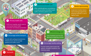
![[infographic] Health and climate: Co-benefits](https://www.bmj.com/sites/default/files/styles/bmj_infographic_thumb/public/cccb-cropped.png?itok=FTB6TwUU "Health and climate: Co-benefits")


![[infographic] Tobacco: Not a slain dragon](https://www.bmj.com/sites/default/files/styles/bmj_infographic_thumb/public/1-a-global-pandemic_v8.png?itok=Ps80mKOQ "Tobacco: Not a slain dragon")


")


